vSC Web Groupsm
Connecting business & community...
portfolio
Here is a sampling of our web projects. The sites display a variety of designs; accompanying notes identify how the client's business concerns were addressed.
Investment Management
The storied firm of TIA (Trust Investment Advisors) wanted to broaden their sales effort to bring their innovative financial services to a broader public.
Developing the site required extensive exploration and conversation to identify the the distinctive qualities that distinguish the firm from other investment management firms. The design reflects the traditional green of financial firms, with a more contemporary look designed to engage the visitor and reflect the kind of personal interaction that they receive.

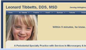
Periodontal Practice
Dr. Tibbetts is one of the leading periodontal specialists in the nation. He is a nationally known speaker, is a contributing author to the major periodontal textbooks, and has made significant contributions to the field through research and teaching.
The newly developed website is designed to bring local focus to this practice, invite collaboration with other dentists, identify the practice to potential patients, as well as providing a resource for peers.

Grocery Chain
Double 8 Foods needed to update their static website developed in an earlier era. There was one necessary requirement: to be able to update multiple sales flyers weekly.
The new site was developed in Concrete 5 which provides an industry-standard end user editing interface. Through conversation, it became apparent that the president really enjoyed communicating with and selling to consumers directly. A number of other features such as a weekly poll, multiple contact us forms, and an easily modifiable "events" page were incorporated.

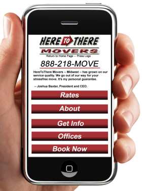
Mobile Website
The mobile website for Here to There Movers was suggested by the large number of mobile visitors to the main Here to There website. By stripping that site to the essentials, and focusing on the most important user interaction, the mobile site now fully addresses the needs of the mobile visitor.
The company chose a mobile website rather than a mobile app. This approach provided a cost-effective solution as well as one which all smartphone users could access without downloading an app.
The mobile site is fully integrated into the main site with a redirect for mobile devices. It also is designed to work as well with computer access, so feel free to visit the site on your current device.

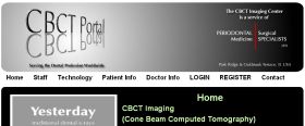
Portal
The CBCT Portal actually serves as a complete web application. It provides information for dentists and patients about the latest CBCT imaging technology. For registered doctors, it provides an interactive list of all patients referred as well as the ability to upload and download images and studies. Special features of this include: PDF generation, as well as gigabyte storage in the cloud.
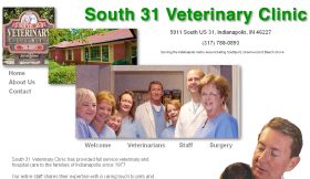
Veterinarian
This veterinarian understood that the Internet is playing an increasingly valuable role for communicating with clients, providing information of value to the general public, and encouraging potential clients to visit. This clean and straightforward site communicates their message.

Broad Ripple Home Tour
For this year's tour, the web task force emphasized user-friendliness and clean design. The new design drew potential visitors and oriented them to the tour. Great homes, beautiful weather, and the redesigned website helped bring the attendance to the 2nd highest - exceeded only by the inaugural year of the tour. Careful recording and analysis of the 1,100 "interested visitors" to the site will provide valuable information for next year's revision. A minimal amount of the standalone site has now been incorporated into the main BRVA site.
HUNI
The Historic Urban Neighborhoods of Indianapolis site has grown from a logo contest, to a full-fledged site encompassing all of Indianapolis' historic urban neighborhoods. It is designed as a portal -- so that visitors can learn more about this living tradition through profiles. The site is currently under redevelopment with a content management base. This will allow the editorial board to update and maintain a much broader range of information -- special activities, legislation and more.
Photographic
Some photographic studios have 2 websites -- a gallery style and a commercial website. The gallery style website to showcases the artistic side -- maximizing images and minimizing text. The commercial side addresses the informational needs of clients -- current and potential.
This first site shows a simple gallery of local panoramic scenes.

Tower Studio Photography
Tower Studio Photography offers a number of photographic services -- individual, group & school -- to the communities of southeast Indianapolis. The goal of this site was to support the existing clientele with useful information/forms, and introduce them to other services they might be interested in. Traffic has increased as much as 500% in 2 years -- showing a the value of integrating a website tightly with a bricks and mortar business.
van Santen Consulting
Web development follows on our career of business software development. There's still occasional call for this expertise. This website is a good example of a resumé or small business site, which identifies the skill sets, appropriate projects and styles of working.


